creative direction
FROM TRADE
TO treasure.
Rare Colors had the stones. What they didn’t have was a story anyone outside the trade would hear. They came to me to change that — a full creative pivot from B2B diamond dealer to a D2C brand that makes you feel something before you ever see a price.

A BRAND BUILT FOR
DEALERS, NOT DREAMERS
Rare Colors had decades of expertise sourcing the world’s most extraordinary natural fancy color diamonds. But their entire identity was built for the trade — no consumer-facing voice, no emotional storytelling, no visual language that could make someone fall in love with a stone through a screen. The ask was clear: make people care about color before carat.
DATA BEFORE
DIRECTION
I started where the numbers live. A comprehensive deep-dive into Google Search Console, GA4, and Shopify analytics to map traffic patterns, search intent, and purchase behavior. Then I paired the quantitative with the qualitative — stakeholder interviews to surface institutional knowledge, identify brand DNA, and map the competitive white space Rare Colors could own.
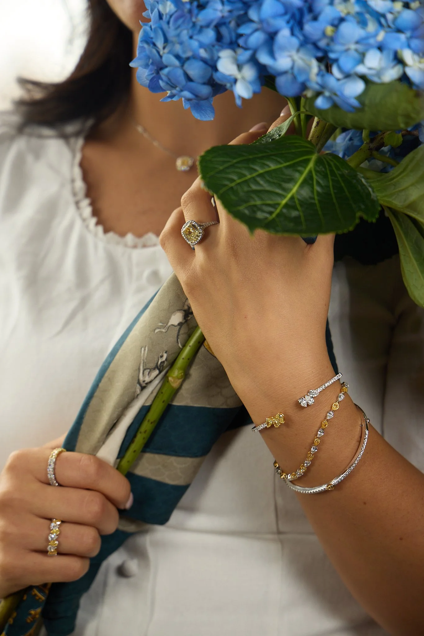
 Lifestyle Direction
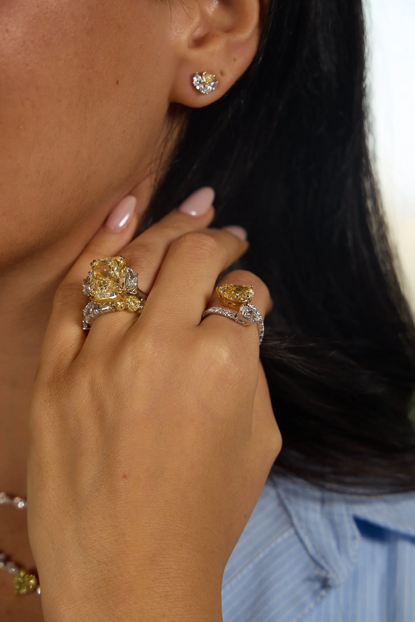
 Editorial Detail
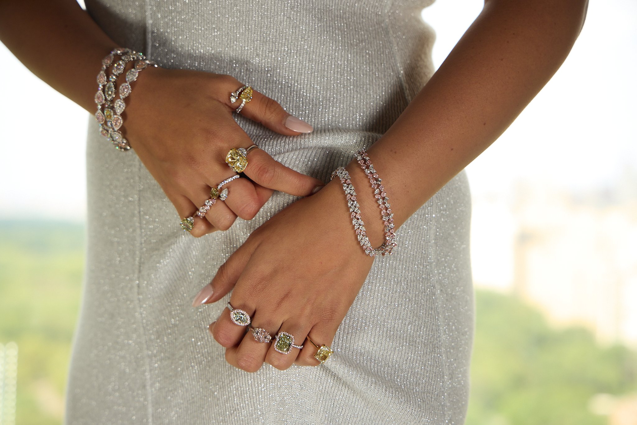
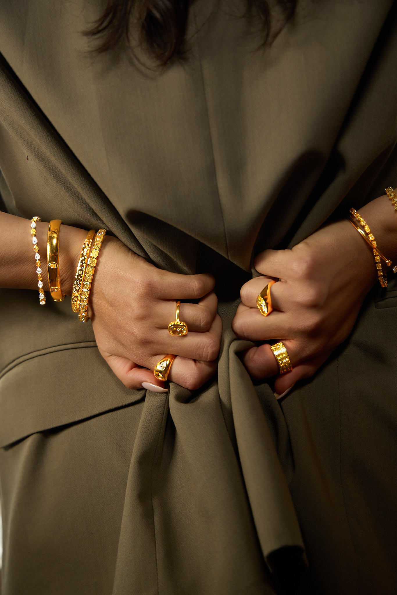
 Product Close-Up
PERSONAS THAT
SHAPED EVERYTHING
From the research emerged distinct buyer personas — from the self-purchasing collector to the milestone-driven romantic. Each one informed a new tone and voice framework: authoritative yet intimate, knowledgeable but never cold. A language that honored the rarity of the product while making it feel personally attainable. The kind of voice that says “we know our stones” without ever talking down.
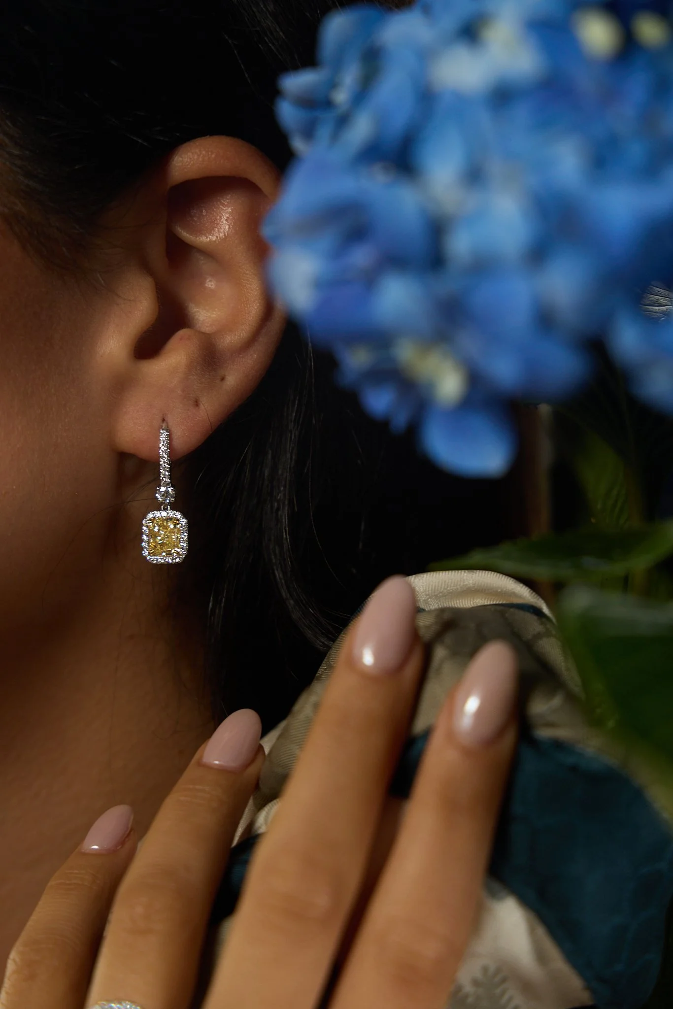
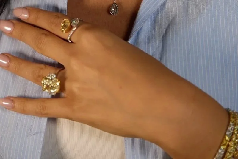
THE FIRST D2C
SHOOT — DIRECTED
I led art direction for Rare Colors’ inaugural direct-to-consumer photoshoot — translating the persona work and brand voice into a cohesive visual identity. Every lighting choice, composition, prop, and styling detail was designed to make the consumer feel the diamond’s story, not just see its specs. This wasn’t catalog work. It was the brand saying hello.
DELIVERABLES